Red Box Miami 2.0
Revisiting a past project and contemplating "how could I make this better?" is both exciting and a bit challenging. The initial cringe, realizing there's room for improvement, is a mix of discomfort and motivation. It's a nuanced exploration, questioning not only the shortcomings but also the merit within and the desire to retain some sort of originality.
Objectives were clear: to re-brand identity that evokes convenience, user-centric, and comfort, translating it into an engaging UI design. The overarching goal was to blend these elements seamlessly in the development phase, ensuring a cohesive user experience.
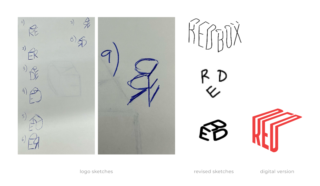
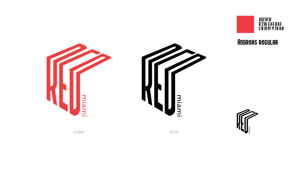
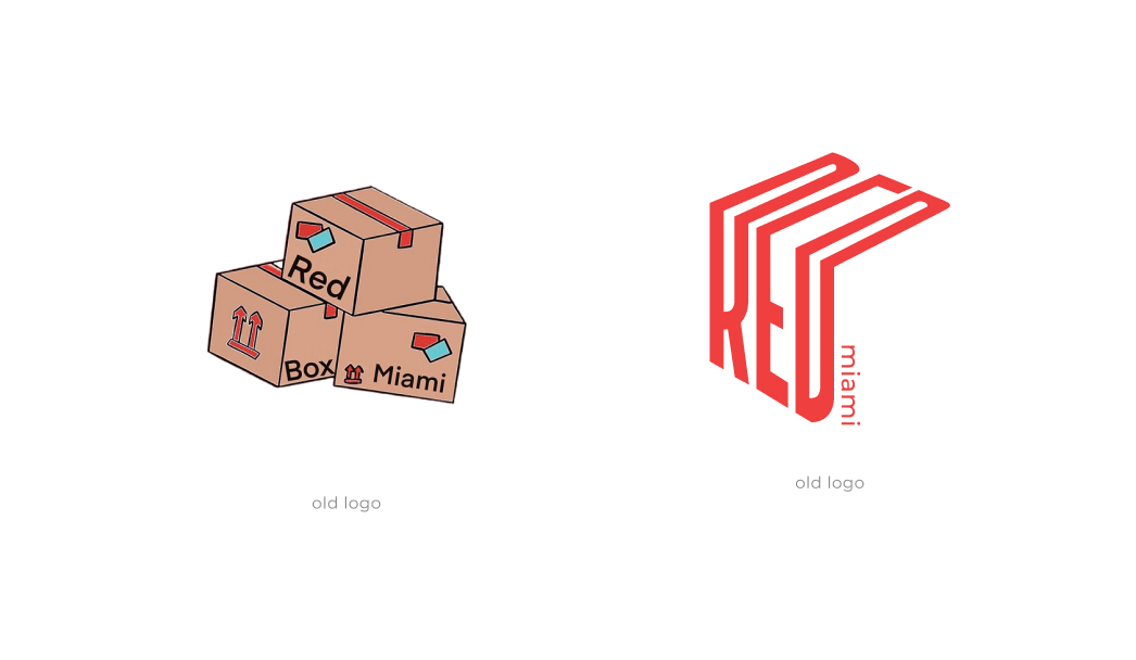
Beginning with the logo, I embarked on a redesign journey, aiming for innovation and a modern aesthetic. I started with sketches and, following some research, narrowed down to three possibilities. Eventually, I opted for the third, envisioning a box with the word "RED," each letter on a different side. However, upon digitizing the design, it didn't meet expectations, leading me to revisit and expand on the initial concept. Here's the resulting final design.
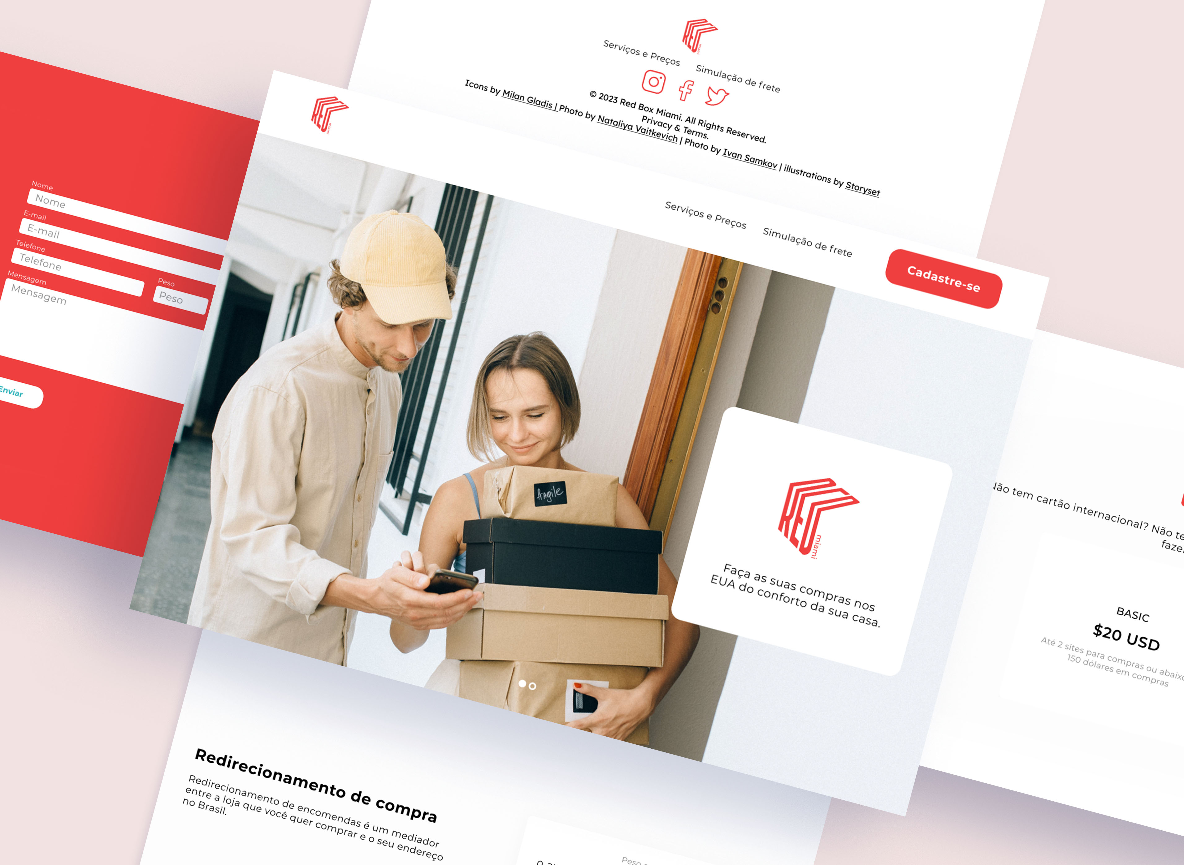
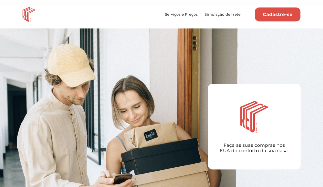
Numerous changes were necessary, and following my certification and mentorship, I effectively applied the knowledge I had gained over the past year. On the main page, I updated the logo, introduced a call-to-action button, and incorporated a sense of effectiveness and coziness to enhance the user experience, through the use of carousel images. To integrate the colors, I designed the menu to transition to a blue either upon hovering the mouse or clicking on it.
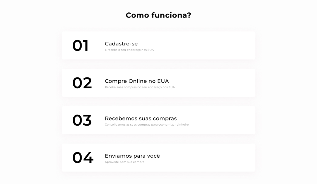
As part of the steps, I removed the redundant CTA button, opting for a more minimalist approach with numbered carts and concise explanations. Similar to the menu bar, the color shifts to red upon hovering or clicking.
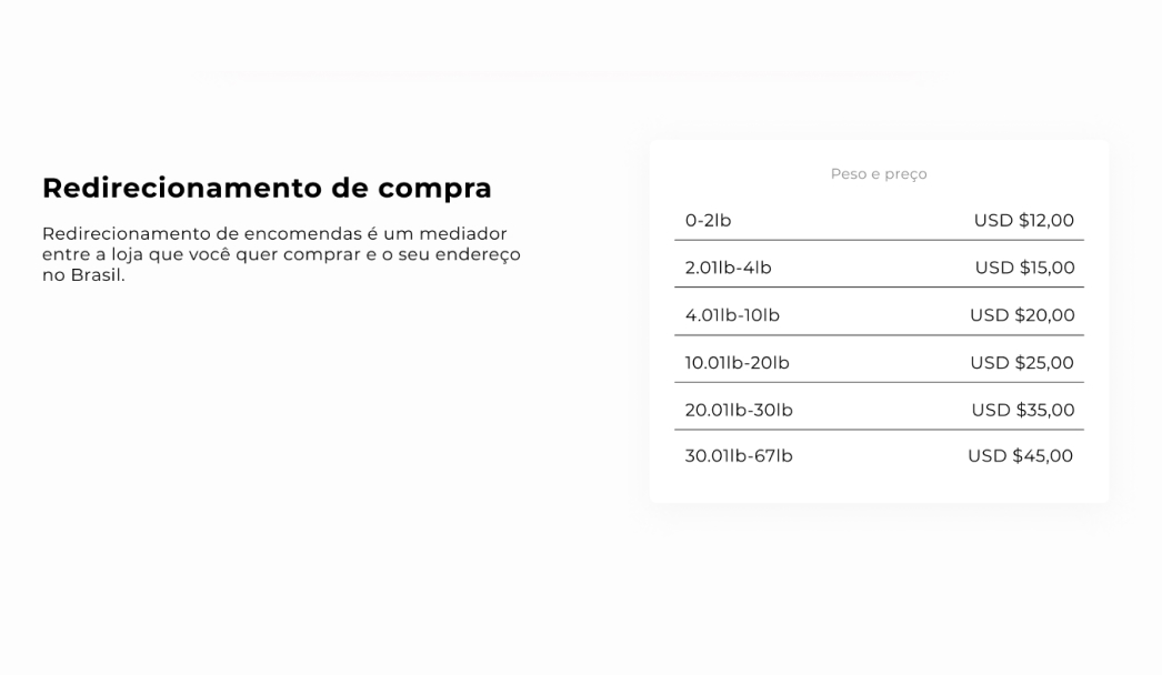
For the first service, being the standard offering, I established a dedicated section. I crafted a succinct table to enhance the clarity of pricing, eliminating redundant steps for a smoother customer experience. Additionally, I opted for a white background to achieve a cleaner and more polished aesthetic.
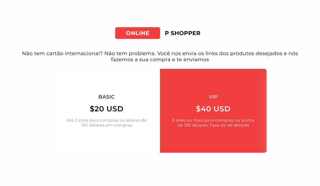
For the next two services, I integrated a dynamic tab system that adapts to the user's selection. To improve clarity, I included carts displaying the prices. Regarding UX writing, despite the content being in Portuguese, I added the terms "BASIC," "EXECUTIVE," and "VIP" alongside each price to enhance the attractiveness of the selection process for the user.
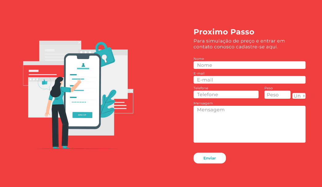
For the registration process, I streamlined the message and weight simulations to reduce clutter, and introduced a subtle animation. In the call-to-action (CTA), the button undergoes a color change when hovered or clicked. Revamped the footer for a cleaner appearance by incorporating social media icons.
The project's results resonate significantly, surpassing its previous state. The brand has evolved into a captivating narrative, stirring the intended emotions, meticulously brought to fruition through a seamless integration of visuals and interactions. The UI design not only captivates attention but also navigates users effortlessly through the digital terrain. Ultimately, a responsive and dynamic website has emerged, encapsulating the brand's essence and effectively engaging visitors.

